
01
Survey and study for Eurail
Pain points: Users couldn't find the same journey on the Eurail app and website because the timetable scales differ, leading to inconsistent results. As a result, they couldn't book seat reservations since the train was missing from the search.
Role
UX Research
UX Design
Qualitative research

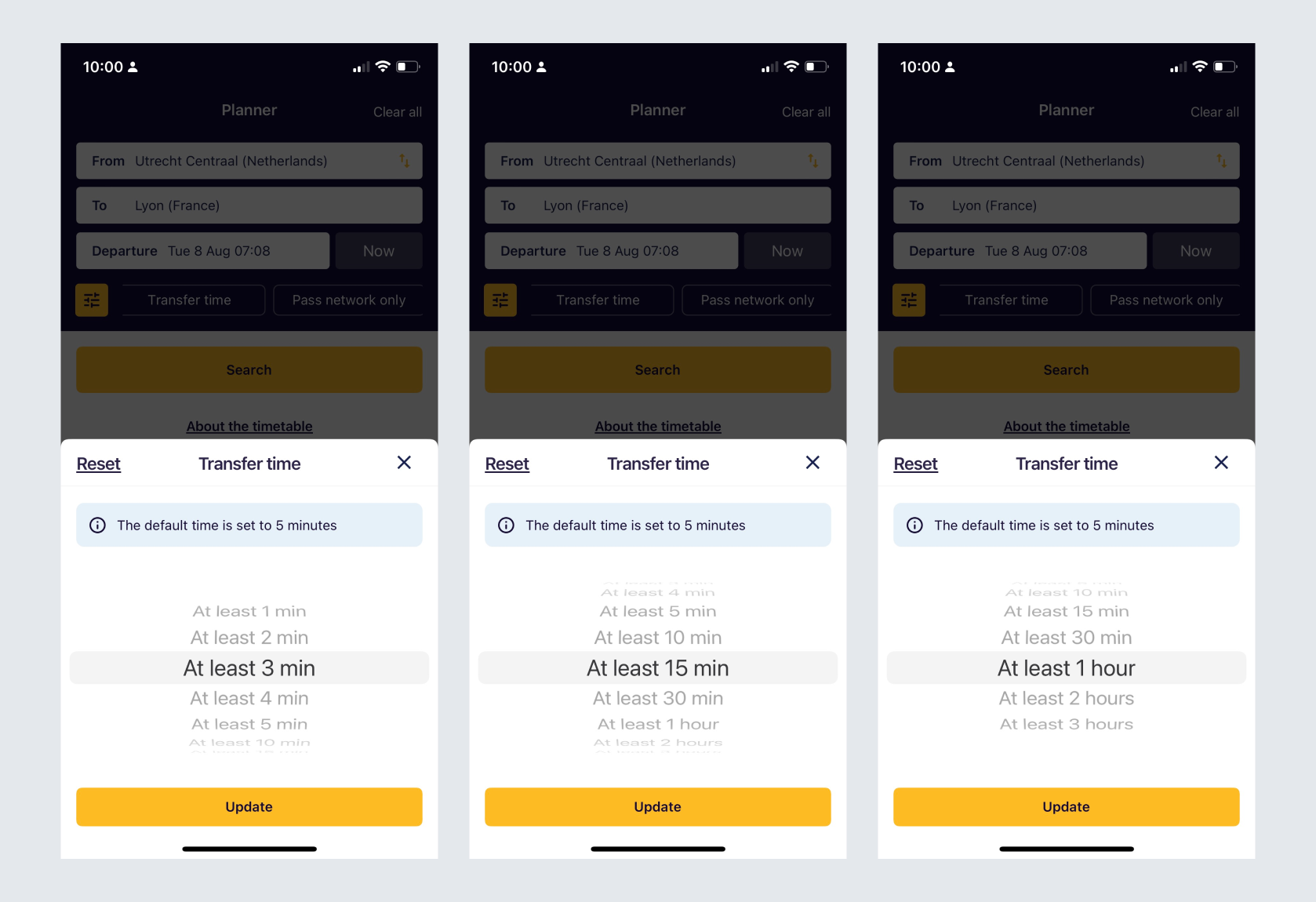
First I found out there are different scales between the web and the app.
In the app, the transfer time scales are 1, 2, 3, 4, 5 min, 10, 15, 30 min, 1h , 2h, 3h
In the web version, the scales are 0m, 10m, 20m, 30m, 40m, 50m, 60m

I began researching what our competitors are doing and noticed that most of them offer no more than five fixed options. In NS, they use single-select buttons with a default of 0 minutes transfer time, showing all search results, which can be seen as a "no value applied" option. In SNCB, they also use single-select buttons with a default 0 value. In SBB, they use radio buttons with a default value of "standard transfer time..."

We created a 3 minutes survey to understand what users need, questions such as "How much time would you prefer for your train transfer at a station for most of your journeys? Please select the category that best suits your preference." and "Do you remember which transfer time you selected most?"


we decided these values based on the survey:
(At least) 1 min, 5 min, 10min, 15 min, 20 min, 1hr
In the survey result we found out:
Final design based on data


